Here is another weekly Distilled Art update! This week, Erik shares some of the revisions that have been going on behind the scenes:
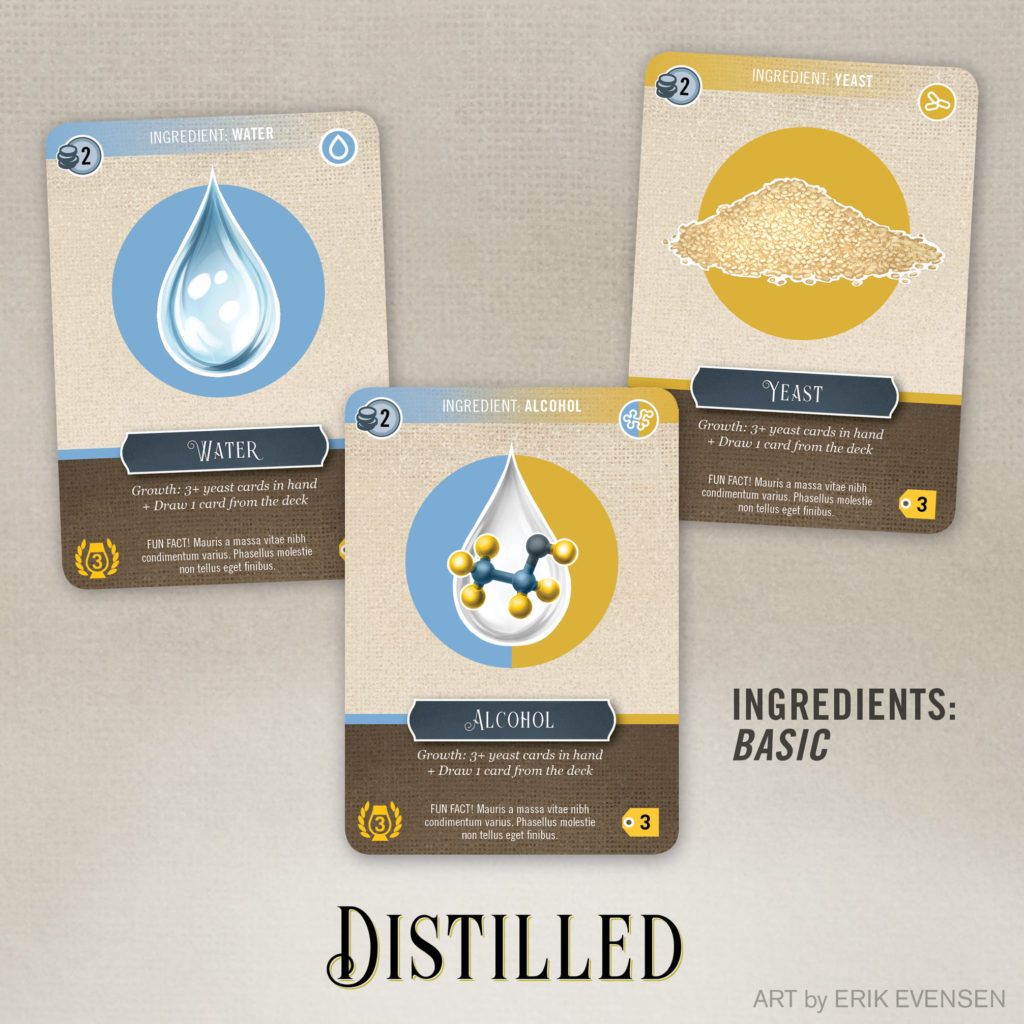
“The structure of the game has evolved, and so it was time for the design of the cards to follow suit (Ha! I kill me). Formerly, each card type had its own design—barrel cards were different from bottle cards, which were different from yeast cards, etc. But as the game has been evolving, it has become clear that there are really three types of cards. The first grouping, the basic ingredients, represents the ingredients that are easily passed around and shared. They’re cheap, and you can always distill something with them. This is where water, yeast, and alcohol fit (with alcohol functioning as kind of a ‘wild card,’ mechanically stepping in to serve as either yeast or water if needed). They’re placed on a burlap background, representing sacks of ingredients passed around, purchased, or traded.”
“The second grouping, the market ingredients, represent ingredients you need to purchase individually for specific recipes. They are more expensive and harder to get, but each one opens the player up to a new, more expensive spirit to distill, such as Tequila or Gin. These cards are represented by a wooden crate, to imply a marketplace or shipment scenario. You’ll note that the three subtypes of sugars from last week are represented here (plant sugars, grain sugars, and fruit sugars).”

“The third grouping is the market items. This includes goods needed to distill, such as bottles and barrels. You’ll note there are multiple subtypes of barrels included (wood, metal, and clay), as I posted about a couple of weeks ago. These cards use a stone background to represent their storage rooms in the “basement area” of the player mat.

Again, these elements are works in progress. The icons, numeric values, and text are for “visualization purposes,” and are not necessarily representative of the final card design. You’ll even see what’s called Greek Text on the cards—this is a commonly used block of dummy text that we graphic design types use to visualize the flow of type before that copy is written. I’ll continue to use this until probably the final couple of rounds of design. The redesign is meant to add some lost structure and hierarchy to the visual system of the game.