While I am excited to post the next “Distilled 3.0” series about the player mat, I couldn’t help but post this in the meantime, as two great pieces of content were created for Distilled and the studio, that I simply had to share!
First, our artist and graphic designer, Erik Evensen, has created a fantastic new identity for the studio publishing Distilled, Paverson Games. Erik posted a great narrative on our Facebook group, and I couldn’t help but repost it in its entirety here:
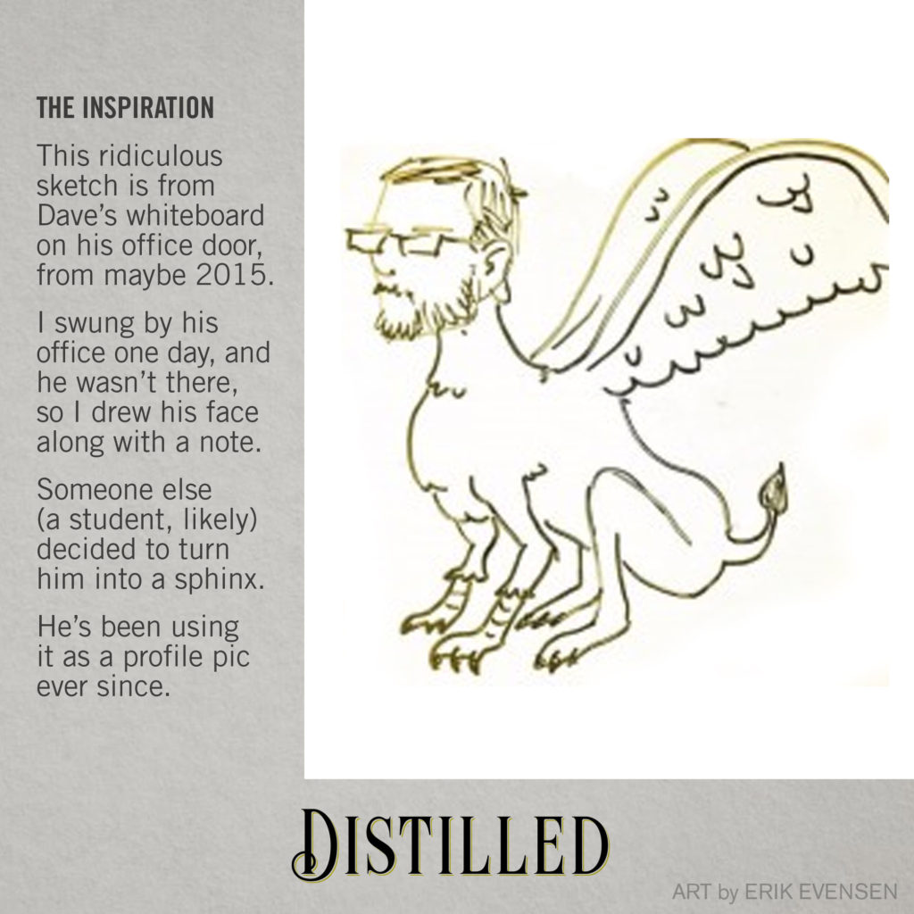
“Hey, everyone! Erik here, back with another one of those block-rockin’ Art Updates. Since we unveiled it a few days ago, I thought it might be fun to share some process behind the logo for Paverson Games, the parent studio behind Distilled. Before I started my career in academia, I logged some time in industry as a graphic designer. “But wait,” I hear you exclaim, “I thought you were an illustrator!” I am indeed both, but the thing about the graphic design field is that you often fill more than one role. My combination of skillsets meant I did a lot of identity design, for Vital Design in Portsmouth/Boston/San Francisco, for Phuse in Toronto, and as a freelance consultant through a handful of studios. With Paverson Games, the themes that Dave wanted to ideally communicate included history/the “ancient world” (Dave’s double-major in college was in Ancient Studies), education, and of course games. Since his creative work is incredibly refined, or finely-crafted, it was important to both of us that the identity communicate this, with a modicum of playfulness. I went through a bunch of concepts, essentially spinning my wheels, thinking about lampposts, architecture, etc., and during one video chat, Dave joked that maybe we should just use his BoardGameGeek profile pic. This profile pic is actually a photo of a sketch I left on his office door several years ago (maybe 2015). I had swung down to talk to him about something, and he wasn’t there, so I did what I usually do—left a note, and a dumb sketch of his face. Eventually, some students decided to give the face a gryphon’s body, and a profile pic was born!
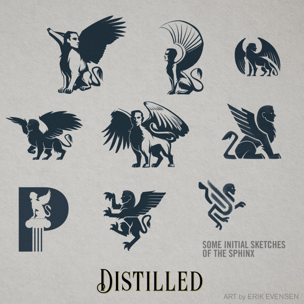
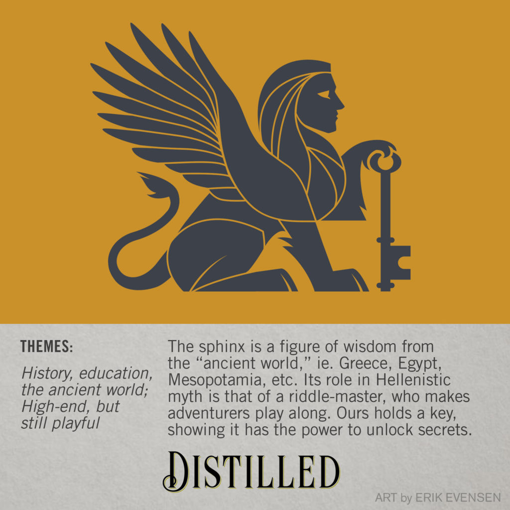
But it got me thinking: for starters, it’s not technically a gryphon if it has a man’s head. That makes it a sphinx. And sphinxes are representative of the “ancient world,” specifically Egypt and Greece, as well as Mesopotamia, and similar figures in southeast Asia and beyond. And on top of that, the sphinx is a mythological game-master, a threshold guardian who challenges passersby to a riddle contest! So through that lens, you can see it as a game, challenge, contest, and an educational experience. Hellenic sphinxes are usually winged and female, and Egyptian ones are usually reclining, wingless, and male, but in all honesty, it doesn’t matter much—blending these together seemed more appropriate, anyway. Dave saw my logic and gave me the green light. I tried a whole bunch of variations on the sphinx, only some of which are included here, but it finally came together when I gave him a key.
A very early Paverson concept included a keyhole in the O, but we didn’t love it… but this did the trick! We selected a gold and dark grey color palette, which deliberately harkens back to the surviving colors of classical antiquity, specifically the figurative art on Grecian urns. But after the fact, we realized that this was pretty similar to the color palette of St. Olaf College, where Dave studied Art and Ancient Studies, bringing the whole thing full circle.
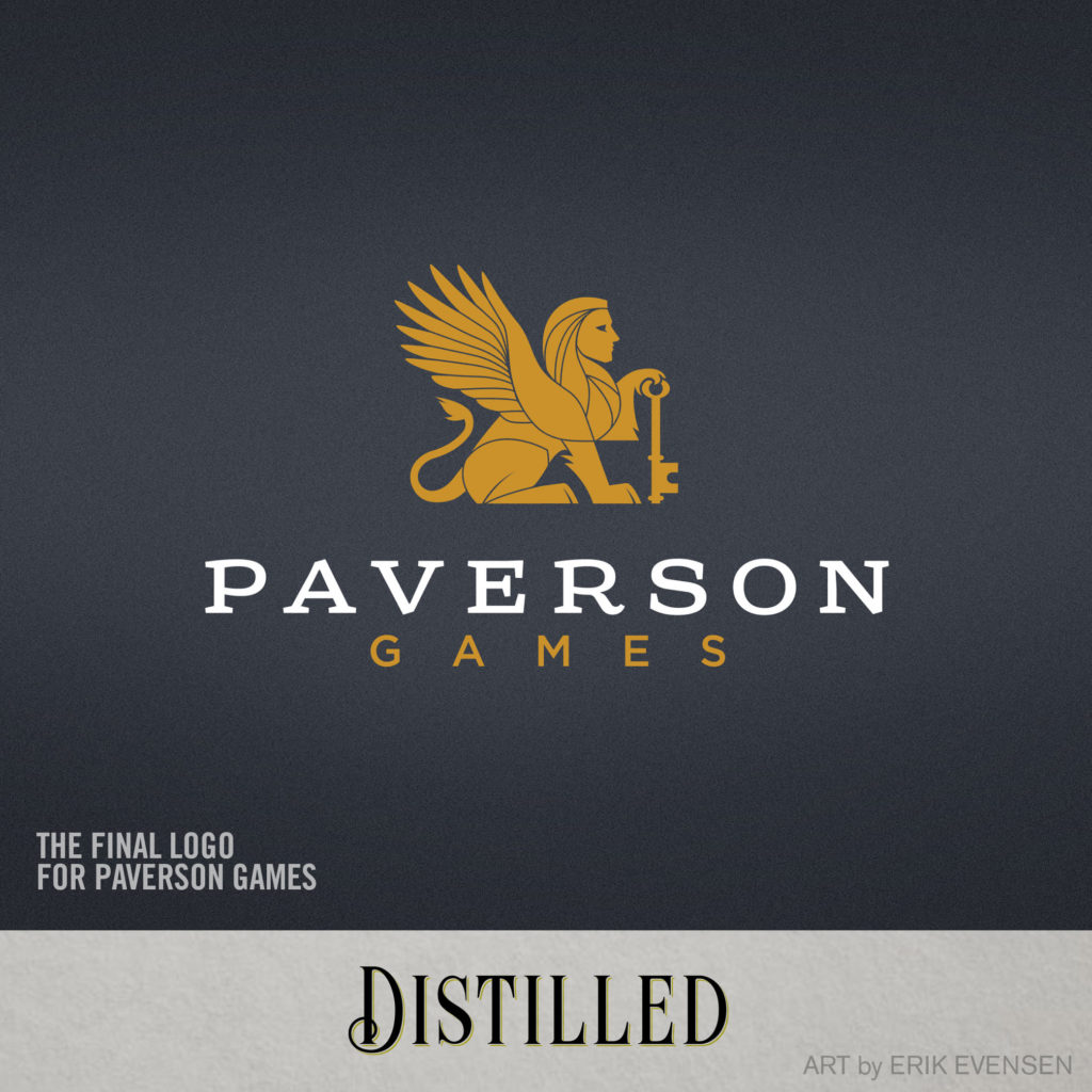
The typeface we used is called Sreda, a friendly and slightly quirky slab-serif from the Glenjan type foundry (circa 2011). It is available as a free font, and I’ve never been able to use it in a project until now. Fun fact: Slab serifs (like Sreda) are also known as “Egyptian” typefaces. They’re not Egyptian at all, but the 18th century, European typographers who developed them wanted to give them a name that sounded ‘exotic’ to their ears, and there was an intense cultural fascination with Egypt during that time. The word “GAMES” is set in Gotham, the rockstar workhorse sans-serif typeface of the 21st Century. We felt this combination felt structured and refined, but with a playful spirit that you can see in the letterforms of the R, S, and N, specifically.
I’m incredibly thrilled with this logo, and excited to see it spread its sphinxy wings and take flight.”
If that wasn’t enough excitement for one week, I also had the pleasure of chatting with Paul Bedford, from Australia, who has just begun a big project to interview unpublished designers in his blog titled “Small Ocean, Big Wave Designer Interviews“. I feel very fortunate to be Paul’s first subject, and feel he did a great job of asking some wonderful questions that got me thinking about me as a designer, including my process behind Distilled. I’d encourage you to check out the extensive interview on his blog over at Boardgamegeek!
