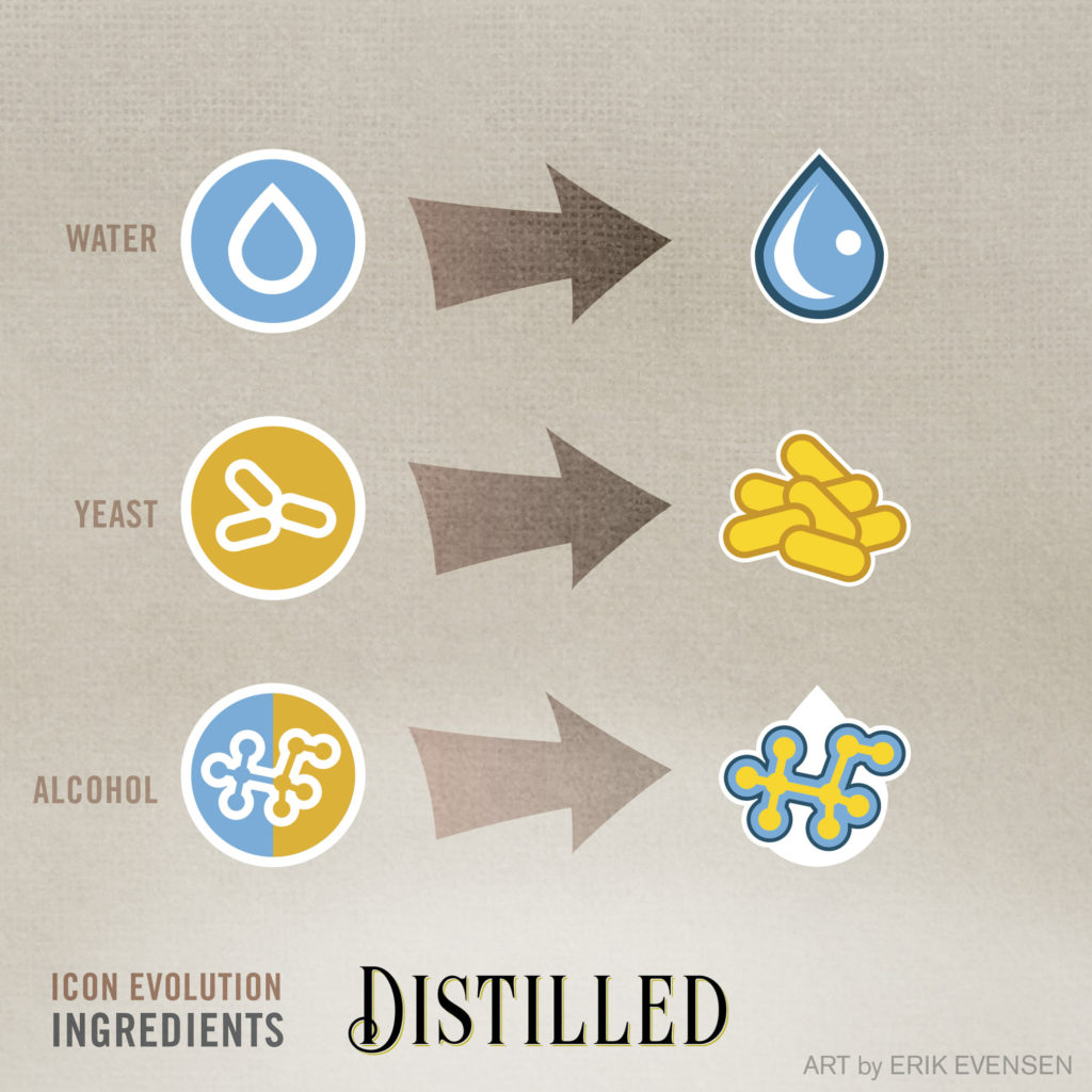
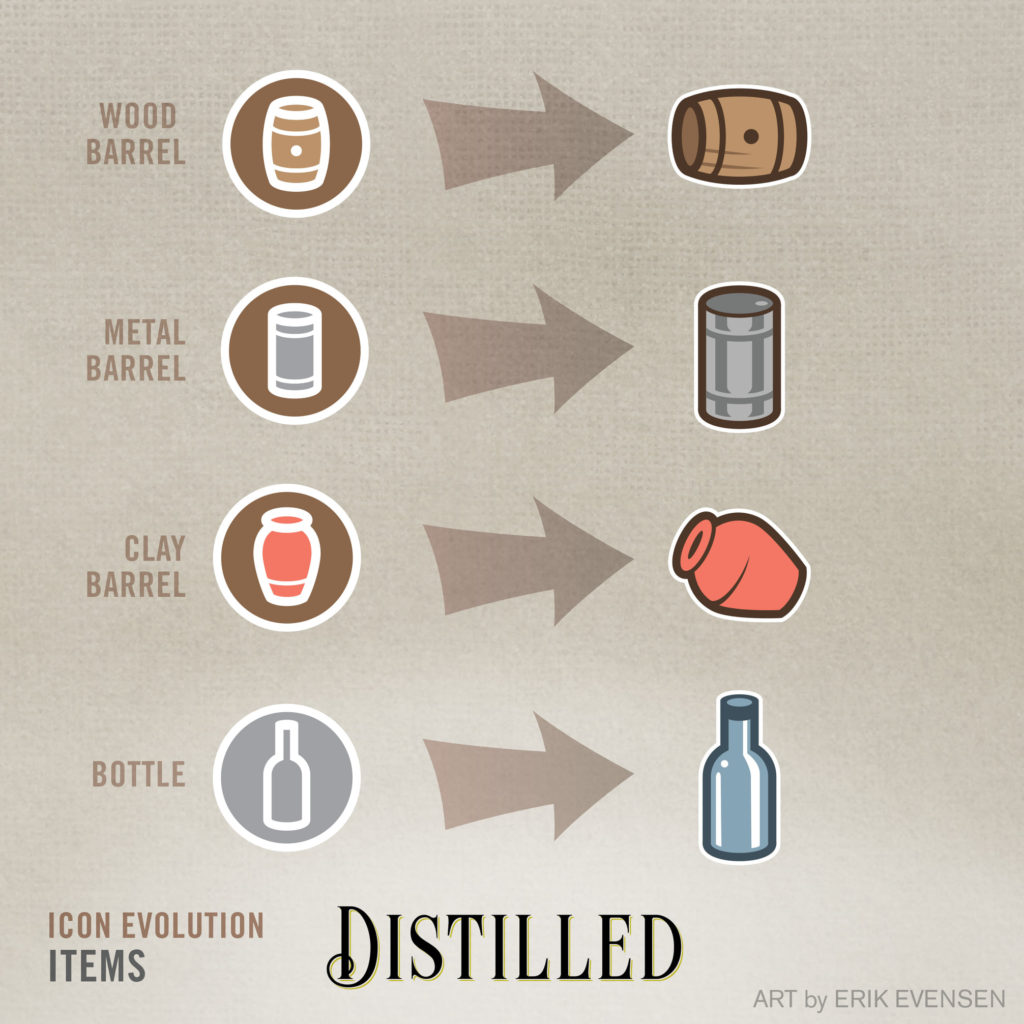
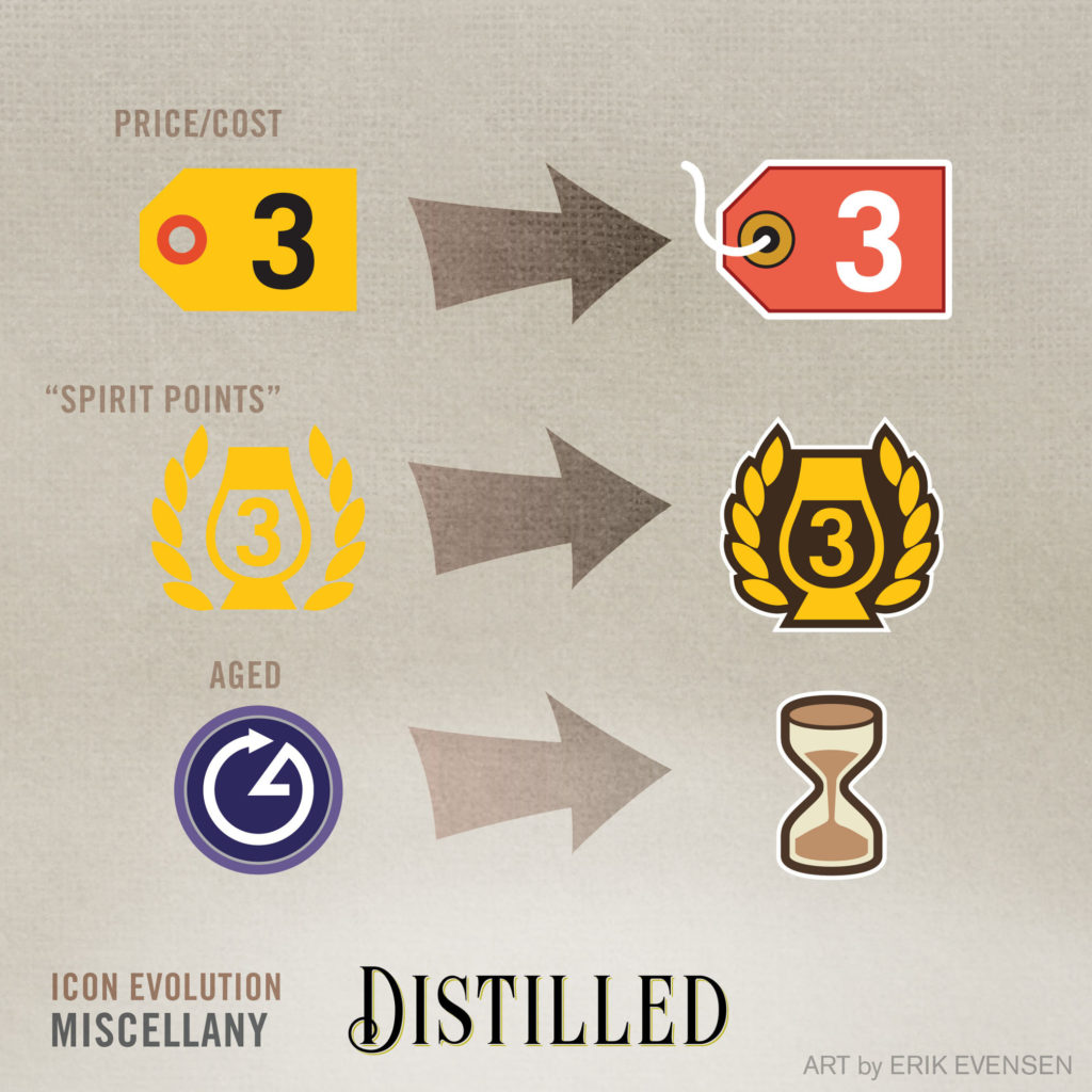
Erik’s been at it again, folks! This week, he’s been taking a hard look at the redesign of the icons of Distilled, to bring them closer to a more illustrative style, similar to what he’s done with the cards and boards. Erik goes on to say:

“The previous icons are fine, but I put them together several months ago, and I always assumed I’d return to their development. As Dave and I have started noticing some small snags with playtesting, it seemed like a good time to revisit them and kill two birds with one stone, so to speak. You’ll note that I’m moving away from the circular icons, and into a more illustrative style. This is done to maximize the “quick readability” of the icons when you glance down at your card. With unique silhouettes for each ingredient, it provides one more way to quickly differentiate between plant sugars and water, for instance. Actually, we have noticed some mix-ups with yeast and grain sugars—I’m hoping that this helps with that, as well as moving the color palettes further apart from each other (more mid-beige for wheat, more “Big Bird yellow” for yeast).

I’m hoping to accomplish a similar legibility with the item icons. Despite the color differences, we see some mix-ups with the barrels. Hopefully by giving each of them more of a stand-alone icon, we’ll minimize this issue.

I also included a few “miscellaneous” icon redesigns, so you can see how I’m working to keep a more consistent look. This is an inside look into the applied nature of user testing with board games. I studied a good amount of design research and user experience design in grad school, but I never wrote a line of code. UX is not synonymous with coding—testing the icons on playing cards and evaluating their effectiveness is just as much about UX as web design is!

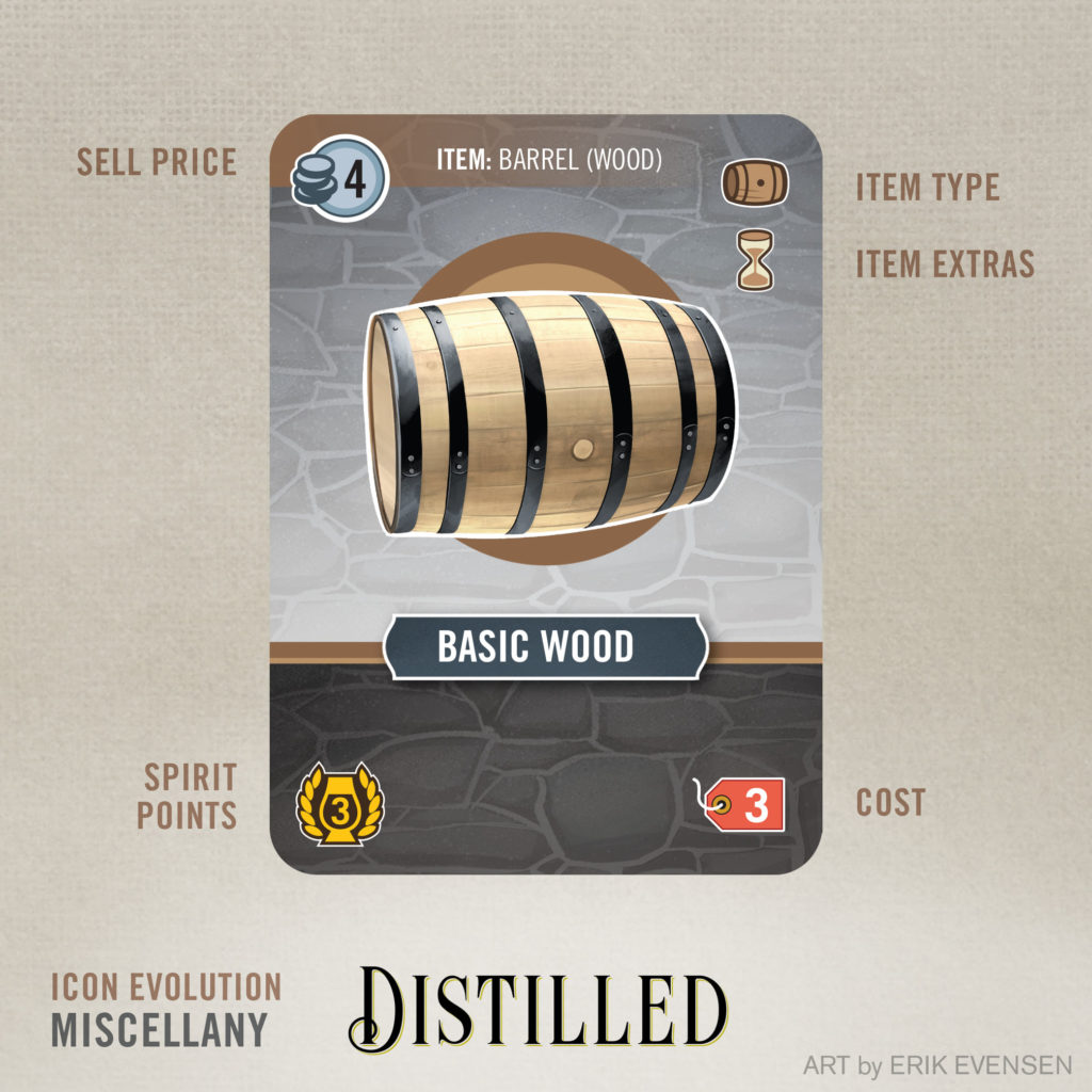
And at the end, I’ve included a mockup of a card, so you can see how each icon would be applied. Note that the “aged” icon now lives under the wooden barrel icon, so you can tell immediately that this thing needs to be aged for it to work. For bottles, this space would be filled by the region icons, which are, so far, unchanged.
